Kitbashing Experience

We’re in a golden age (cue: ominous sound that comes with a loaded word) of prototyping. For most digital designers, it’s never been easier to express ideas in forms that can be clicked, tested, interrogated, and discarded. This should lead to a Cambrian explosion of creativity and diversity — but instead, we find ourselves in a period of incredibly homogenized experiences. Websites follow similar patterns, coffee shops and restaurants barely differ around the details, and connected devices compete for control over your networked ecosystem.
Actually, this isn’t all bad. The obvious example is that many of these experiences are put together by absolutely tiny teams, and so the homogeneity comes from these teams leveraging existing tools. The creativity — at least for our purposes now, let’s call it the novel thing applied to a problem space that hasn’t encountered that thing before — is around some other margin that we might not even recognize until much later in the process.
So, in a way, our golden age of prototyping is actually facilitating something very specific: the ability to get creative on the things that normally don’t make themselves accessible to iteration and development until business and teams are quite established. This is the great side of this work, and honestly is something that facilitated a more strategic type of design work. But there is a problem in that it does really limit the playground around that core site of inquiry. The business model innovation you’re working on can be quickly realized through templates and off-the-shelf design systems, but that very act of framing narrows what might otherwise have been possible.
So, in a way, our golden age of prototyping is actually facilitating something very specific: the ability to get creative on the things that normally don’t make themselves accessible to iteration and development until business and teams are quite established. This is the great side of this work, and honestly is something that facilitated a more strategic type of design work. But there is a problem in that it does really limit the playground around that core site of inquiry. The business model innovation you’re working on can be quickly realized through templates and off-the-shelf design systems, but that very act of framing narrows what might otherwise have been possible.
Great design is emergent — from teams, from moments, from what we immerse ourselves in, from talent, from practice. But it also emerges from the iterative nature of design itself. I create a dozen, three dozen, a hundred things — from scratch or in parts — and the form of the things we design starts to emerge, and the decisions that we make around that design are pulled by the gravity of those past iterations.
So the real problem with this is that when we leverage these toolkits for moving and prototyping quickly without recognizing them for what they are — scaffolding — we run the risk of mixing the detritus of many, many past decisions in with our otherwise novel inquiry. A disruption becomes disrupted.
Sprues
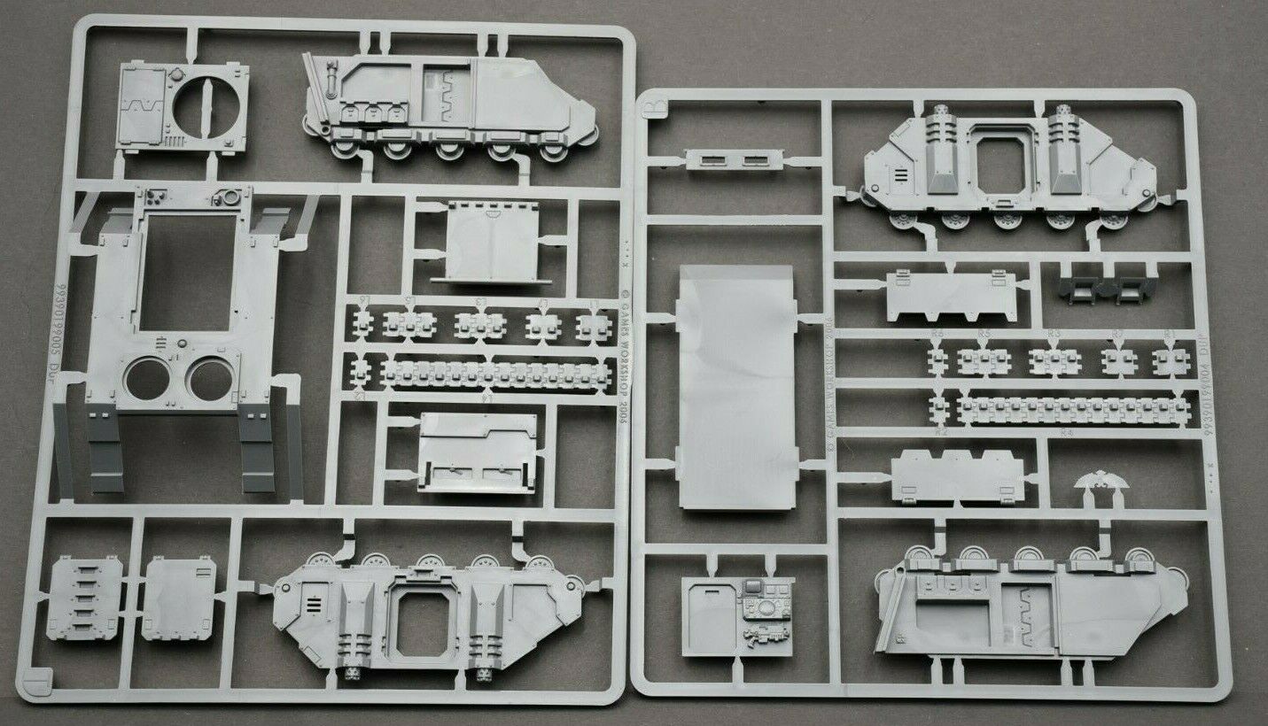
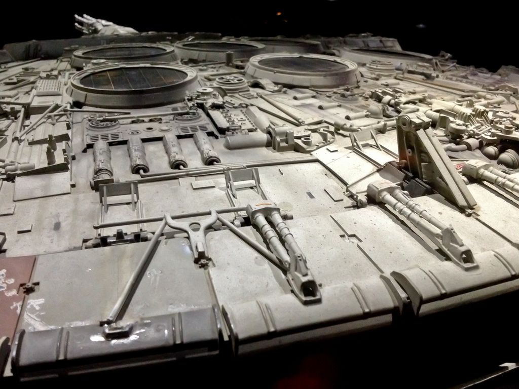
There’s thankfully tons of solutions for this, and one that occurred to me recently was around kit bashing. I shared a really interesting article about this last week about ILM using Kitbashing techniques to help design the “used future” feeling in Star Wars. Kit Bashing is basically just a technique for taking a lot of different scale model kits — a tank, a giant robot, a train, a car — and combining the individual cast parts into some greater whole.
That way, you can go from something like this (called a sprue card):
And, after combining it with lots and lots of other such contraptions, end up with something like this — a just-believable-enough take on another world.
Now, in theory, what I just lambasted as a potentially poisonous design approach falls into this category: after all, isn’t a toolkit approach the same as using spurs? What is a tool like Uber’s Base Web, or Twitter’s Bootstrap, or the US Government’s Web Design Standards but a collection of UI sprues?
Kitbashing is different though. You can think of a lot of design templates as almost like sticker sheets: you get an aesthetic, a form, a prescribed function that gets pasted over different types of functionality — and those stickers end up being recognizable cues for the functionality underneath. Dropdowns select options, buttons trigger interactions, a large or small X demarcates exiting an experience, etc.
Kitbashing, on the other hand, takes many different pieces of potential functionality — an engine shape, a wheel, a barrel, an antenna — and mixes them up into different forms that eventually emerge something all-together different.
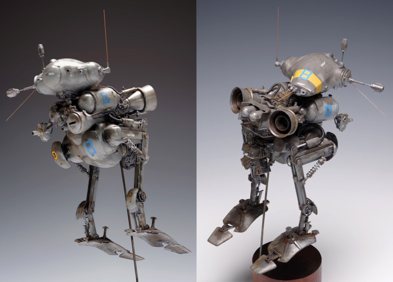
One of the classic kit bashing examples is from designer Kow Yokoyama, who created a model making brand in the 80s called SF3D. Working quickly with two friends in creating a narrative and visual aesthetic for the world, he took a large collection of existing scale model kits — planes, tanks, motorcycles, etc — and starting drilling, gluing, and sculpting connections between the disparate parts of those kits to create something entirely new.
Something like this:
Kitbashing Experiences
This mechanism for design is exciting partially because it empowers us to mix and match functionality outside of its usual context. Combined and remixed, they have the potential to create something new.
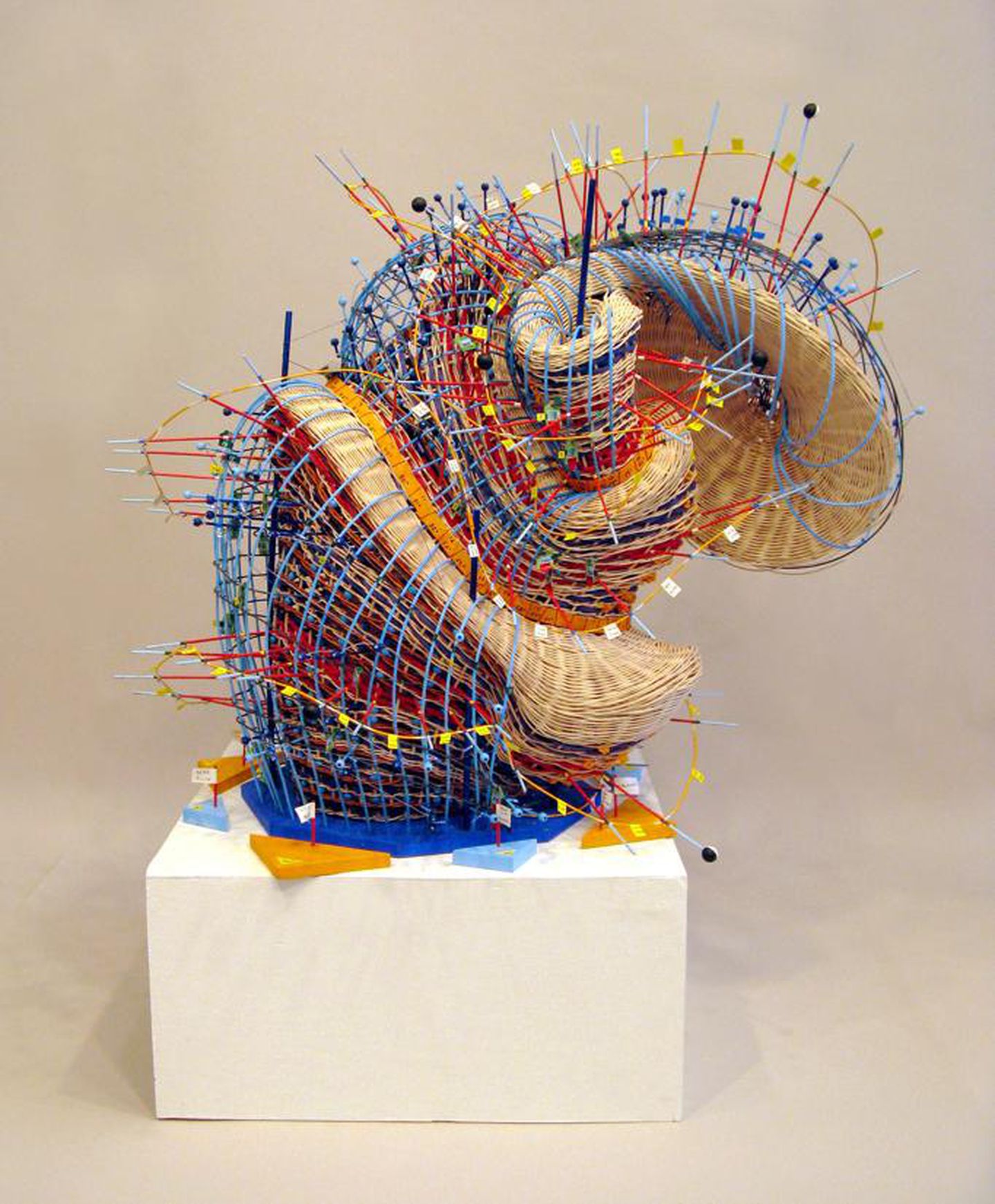
One example might be Nathalie Miebach’s weather data visualization sculptures. Crafted using traditional basketweaving techniques, the technique is applied not to imply the form of the basket, but rather borrow a structured and quantitatively receptive process from which the forms she displays emerge. Combined with other disciplines like sculpture, the focusing backdrop of a gallery or museum, and the polish applied in colour selection and proportion — and something entirely new emerges.
Another example might be the game (which I’ve yet to try, but sounds incredible) Carrier Command 2. You are apparently put in charge of an aircraft carrier, and command a drone fleet to capture territory around an archipelago. But it does this by combining a few different styles of play, and idioms of interaction: first person movement, flight simulation and “menu surfing”, top down strategy, and tower defense (which has become incredibly popular in the smartphone gaming era). Jammed together, the design of this game seems to rock back-and-forth between the different modes of play, using that frame to keep the player off balance and wholly engaged. Something I wonder is what came first: the idea of merging these different mechanics, or the idea of situating such a game on an aircraft carrier from which those mechanics otherwise emerged?
Finally on the web side, I might point to a weekend project I did two years ago called Fit Faj. The idea was to try and build a mini business in just a few days (based off of my own experience as a new father), and I did it through form of kit bashing.
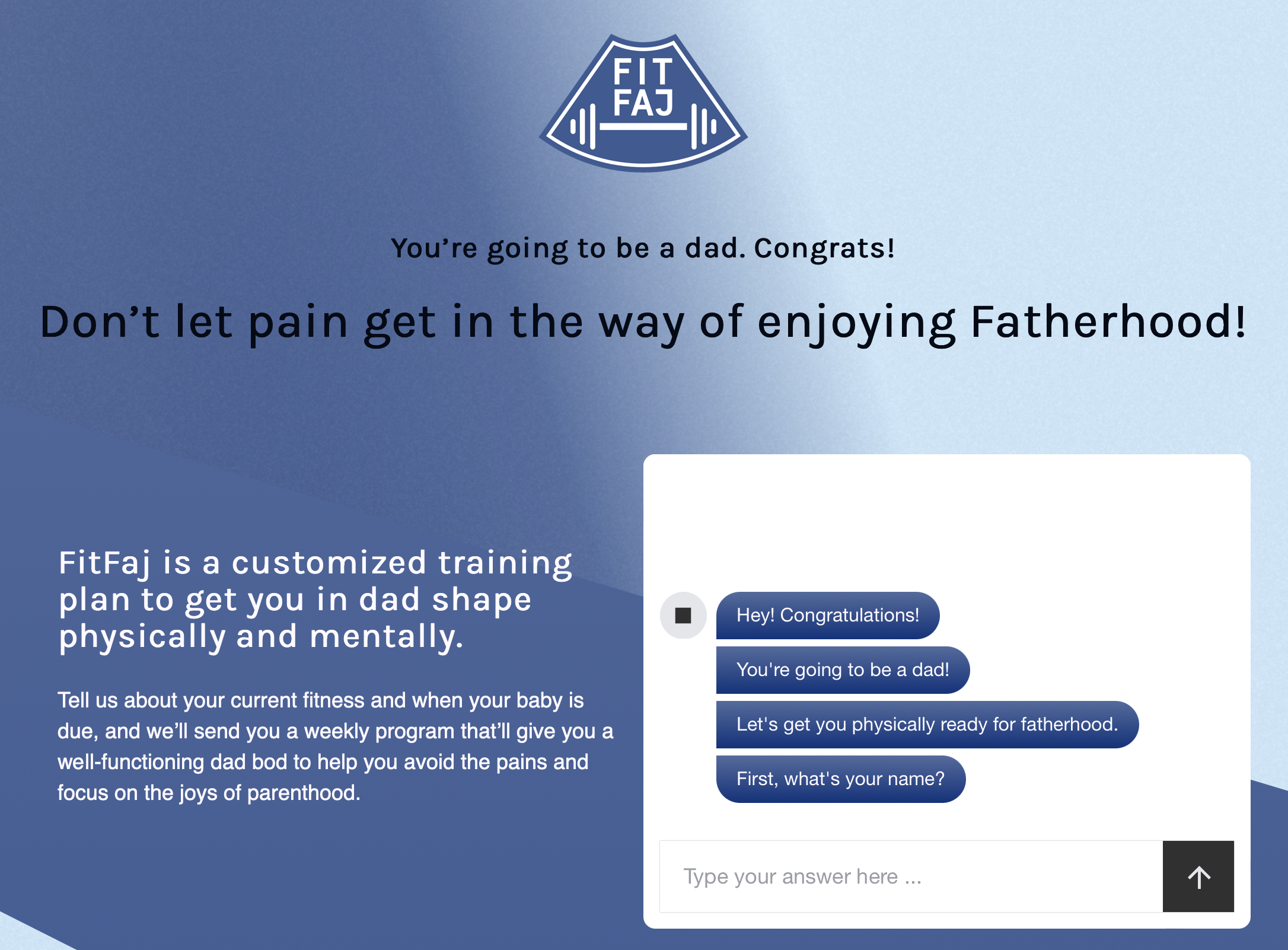
Taking a chatbot library meant for support purposes, I used that to structure the overall signup flow and write a small script that was friendly and let me tailor plans to specific needs and timeframes. This got mashed into a payment portal (Stripe) which I was already using for Knowsi, and which also connected into Google Sheets to give me a quick and easy sense of who my customers were.
Then, again using google sheets, I created a quick script that customized a plan I’d commissioned a certified personal trainer to develop, and scaled it to the needs of the customer. Then, the plan itself is tied to a basic transactional email system — sending the customer that week’s plan every Sunday so they can plan ahead without getting overwhelmed, as well as potentially update their plan depending on their adherence.
Addressing the challenge expressed earlier — homogenized experiences — this project came together as an experiment around designing a product and business that considered a very specific need, but tried to take a non-traditional approach to the experience of purchasing and delivery. Using chatbots and mailing lists, the different touchpoint for the experience came about not necessarily because I thought they were the best thing available, but rather because I had some spare parts lying about my desk (or hard drive, rather). Even design wise, it’s a kitbash between custom components (the images, the content), templates (the site structure is literally just a component from Knowsi), libraries (the chatbot), services (google, stripe), and interaction modes (web, mail, conversation, print-outs).
The neat thing about this approach is that it can be scaled and iterated upon with relative ease. If an experiment or part of the experience doesn’t work, discard it and try something different. If two parts feel disjointed, explore a smoother experience by adding something new to the mix, or rolling a small, custom interface.
Instead of building blocks — structured pieces that fit together — designing an experience through kitbashing is about turning that block around to catch the light differently, sanding off the connectors so it fits with a different brand, and gluing the whole mess together so that the component parts are only recognizable if you squint.